


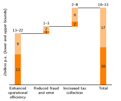
For displaying the total effect of a series of values, a waterfall chart can be useful. For example this chart, taken from “The Economist”, illustrates estimated efficiency potentials in the UK public sector.
We use ybar stacked with an invisible third series for getting the vertical offset, and a const plot for the connecting lines.
\documentclass{standalone}
\usepackage{pgfplots}
\pgfplotsset{width=8cm, compat=1.8, grid style={dashed}}
\usepackage{pgfplotstable}
\pgfplotstableset{
    create on use/accumyprev/.style = {
        create col/expr = {\prevrow{0}+\prevrow{1}+\pgfmathaccuma}
    }
}


% Style for centering the labels
\makeatletter
\pgfplotsset{
    centered nodes near coords/.style = {
    calculate offset/.code = {
        \pgfkeys{/pgf/fpu=true,/pgf/fpu/output format=fixed}
        \pgfmathsetmacro\testmacro{(\pgfplotspointmeta*10^%
        \pgfplots@data@scale@trafo@EXPONENT@y)/2*\pgfplots@y@veclength)}
        \pgfkeys{/pgf/fpu=false}
    },
    every node near coord/.style = {
        /pgfplots/calculate offset,
        yshift = -\testmacro,
        black,
        font = \scriptsize,
    },
    nodes near coords align=center
    }
}
\renewcommand*{\familydefault}{\sfdefault}
\usepackage{sfmath}
\makeatother
\begin{document}
\begin{tikzpicture}
  \begin{axis}[
    no markers,
    ybar stacked,
    ymin = 0,
    point meta = explicit,
    centered nodes near coords,
    axis lines* = left,
    xtick = data,
    major tick length = 0pt,
    xticklabels = {
        Enhanced operational efficiency,
        Reduced fraud and error,
        Increased tax collection,
        Total
    },
    xticklabel style = { font=\scriptsize, text width=2cm, align=center },
    ytick = \empty,
    y axis line style = {opacity=0},
    ylabel = \textsterling billion p.a. (lower and upper bounds),
    ylabel style = {font=\scriptsize},
    axis on top
  ]

  % The first plot sets the "baseline": Uses the sum of all previous y values,
  % except for the last bar, where it becomes 0
  \addplot +[
    y filter/.code = {\ifnum\coordindex>2 \def\pgfmathresult{0}\fi},
    draw = none,
    fill = none
  ] table [x expr = \coordindex, y = accumyprev] {datatable.csv};

  % The lower bound
  \addplot +[
    fill = orange,
    draw = orange,
    ybar stacked,
    nodes near coords
  ] table [x expr = \coordindex, y index = 0, meta index = 0] {datatable.csv};

  % The upper bound
  \addplot +[
    ybar stacked,
    draw = orange!50,
    fill = orange!50,
    nodes near coords
  ] table [x expr = \coordindex, y index = 1, meta index = 1] {datatable.csv};

  % The connecting line. Uses a bit of magic to typeset the ranges
  \addplot [
    const plot, black,
    point meta = {
        TeX code symbolic = {
            \pgfkeys{/pgf/fpu/output format=fixed}
            \pgfmathtruncatemacro\upperbound{
                \thisrowno{0} + \thisrowno{1}
            }
            \edef\dostuff{
                \noexpand\def\noexpand\pgfplotspointmeta{%
                    \thisrowno{0}--\upperbound%
                }
            }%
            \dostuff
        }
    },
    nodes near coords = \pgfplotspointmeta,
    every node near coord/.style = {
        font   = \scriptsize,
        anchor =south
    },
  ] table [x expr = \coordindex, y expr = 0] {datatable.csv};
  \end{axis}
\end{tikzpicture}
\end{document}