


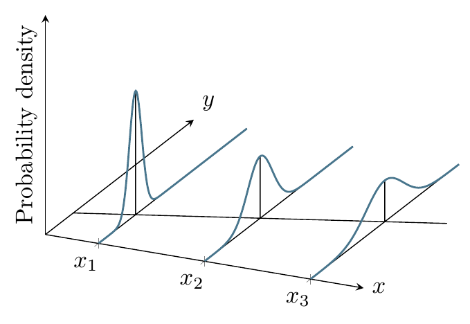
Here’s one approach using PGFPlots, based on the 2D version at Plotting Population Regression Function:
\documentclass[tikz,border=10pt]{standalone}
\usepackage{pgfplots}
\pgfplotsset{compat=1.12}
\begin{document}

\begin{tikzpicture}[ % Define Normal Probability Function
declare function={
            normal(\x,\m,\s) = 1/(2*\s*sqrt(pi))*exp(-(\x-\m)^2/(2*\s^2));
        }
       ]
\begin{axis}[
    no markers,
    domain=0:12,
    zmin=0, zmax=1,
    xmin=0, xmax=3,
    samples=200,
   samples y=0,
    axis lines=middle,
    xtick={0.5,1.5,2.5},
    xmajorgrids,
    xticklabels={},
    ytick=\empty,
    xticklabels={$x_1$, $x_2$, $x_3$},
    ztick=\empty,
    xlabel=$x$, xlabel style={at={(rel axis cs:1,0,0)}, anchor=west},
    ylabel=$y$, ylabel style={at={(rel axis cs:0,1,0)}, anchor=south west},
    zlabel=Probability density, zlabel style={at={(rel axis cs:0,0,0.5)}, rotate=90, anchor=south},
    set layers
  ]

\addplot3 [samples=2, samples y=0, domain=0:3] (x, {1.5*(x-0.5)+3}, 0);
\addplot3 [cyan!50!black, thick] (0.5, x, {normal(x, 3, 0.5)});
\addplot3 [cyan!50!black, thick] (1.5, x, {normal(x, 4.5, 1)});
\addplot3 [cyan!50!black, thick] (2.5, x, {normal(x, 6, 1.5)});

\pgfplotsextra{
\begin{pgfonlayer}{axis background}
\draw [on layer=axis background] (0.5, 3, 0) -- (0.5, 3, {normal(0,0,0.5)}) (0.5,0,0) -- (0.5,12,0);
\draw (1.5, 4.5, 0) -- (1.5, 4.5, {normal(0,0,1)}) (1.5,0,0) -- (1.5,12,0);
\draw (2.5, 6, 0) -- (2.5, 6, {normal(0,0,1.5)}) (2.5,0,0) -- (2.5,12,0);
\end{pgfonlayer}
}
\end{axis}

\end{tikzpicture}
\end{document}
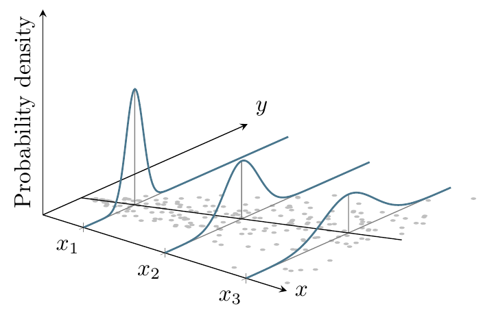
Here’s a version with a different viewpoint and dots that are randomly distributed using a normal distribution with a varying standard deviation (using the approach used in Gaussian Sample):
\documentclass[tikz,border=10pt]{standalone}
\usepackage{pgfplots}
\pgfplotsset{compat=1.12}
\makeatletter
        \pgfdeclareplotmark{dot}
        {%
            \fill circle [x radius=0.02, y radius=0.08];
        }%
\makeatother
\begin{document}

\begin{tikzpicture}[ % Define Normal Probability Function
declare function={
            normal(\x,\m,\s) = 1/(2*\s*sqrt(pi))*exp(-(\x-\m)^2/(2*\s^2));
        },
    declare function={invgauss(\a,\b) = sqrt(-2*ln(\a))*cos(deg(2*pi*\b));}
       ]
\begin{axis}[
    %no markers,
    domain=0:12,
    zmin=0, zmax=1,
    xmin=0, xmax=3,
    samples=200,
   samples y=0,
    view={40}{30},
    axis lines=middle,
    enlarge y limits=false,
    xtick={0.5,1.5,2.5},
    xmajorgrids,
    xticklabels={},
    ytick=\empty,
    xticklabels={$x_1$, $x_2$, $x_3$},
    ztick=\empty,
    xlabel=$x$, xlabel style={at={(rel axis cs:1,0,0)}, anchor=west},
    ylabel=$y$, ylabel style={at={(rel axis cs:0,1,0)}, anchor=south west},
    zlabel=Probability density, zlabel style={at={(rel axis cs:0,0,0.5)}, rotate=90, anchor=south},
    set layers, mark=cube
  ]

\addplot3 [gray!50, only marks, mark=dot, mark layer=like plot, samples=200, domain=0.1:2.9, on layer=axis background] (x, {1.5*(x-0.5)+3+invgauss(rnd,rnd)*x}, 0);
\addplot3 [samples=2, samples y=0, domain=0:3] (x, {1.5*(x-0.5)+3}, 0);
\addplot3 [cyan!50!black, thick] (0.5, x, {normal(x, 3, 0.5)});
\addplot3 [cyan!50!black, thick] (1.5, x, {normal(x, 4.5, 1)});
\addplot3 [cyan!50!black, thick] (2.5, x, {normal(x, 6, 1.5)});

\pgfplotsextra{
\begin{pgfonlayer}{axis background}
\draw [gray, on layer=axis background] (0.5, 3, 0) -- (0.5, 3, {normal(0,0,0.5)}) (0.5,0,0) -- (0.5,12,0)
    (1.5, 4.5, 0) -- (1.5, 4.5, {normal(0,0,1)}) (1.5,0,0) -- (1.5,12,0)
    (2.5, 6, 0) -- (2.5, 6, {normal(0,0,1.5)}) (2.5,0,0) -- (2.5,12,0);

\end{pgfonlayer}
}
\end{axis}

\end{tikzpicture}
\end{document}
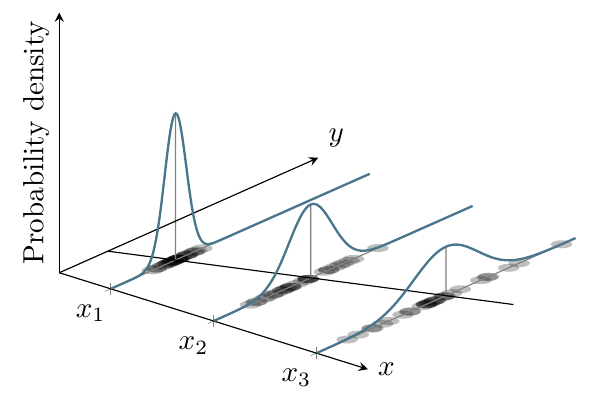
And using a phenomenon that’s discrete in x:
\documentclass[tikz,border=10pt]{standalone}
\usepackage{pgfplots}
\pgfplotsset{compat=1.12}
\makeatletter
        \pgfdeclareplotmark{dot}
        {%
            \fill circle [x radius=0.08, y radius=0.32];
        }%
\makeatother
\begin{document}

\begin{tikzpicture}[ % Define Normal Probability Function
declare function={
            normal(\x,\m,\s) = 1/(2*\s*sqrt(pi))*exp(-(\x-\m)^2/(2*\s^2));
        },
    declare function={invgauss(\a,\b) = sqrt(-2*ln(\a))*cos(deg(2*pi*\b));}
       ]
\begin{axis}[
    %no markers,
    domain=0:12,
    zmin=0, zmax=1,
    xmin=0, xmax=3,
    samples=200,
   samples y=0,
    view={40}{30},
    axis lines=middle,
    enlarge y limits=false,
    xtick={0.5,1.5,2.5},
    xmajorgrids,
    xticklabels={},
    ytick=\empty,
    xticklabels={$x_1$, $x_2$, $x_3$},
    ztick=\empty,
    xlabel=$x$, xlabel style={at={(rel axis cs:1,0,0)}, anchor=west},
    ylabel=$y$, ylabel style={at={(rel axis cs:0,1,0)}, anchor=south west},
    zlabel=Probability density, zlabel style={at={(rel axis cs:0,0,0.5)}, rotate=90, anchor=south},
    set layers, mark=cube
  ]

\pgfplotsinvokeforeach{0.5,1.5,2.5}{
\addplot3 [draw=none, fill=black, opacity=0.25, only marks, mark=dot, mark layer=like plot, samples=30, domain=0.1:2.9, on layer=axis background] (#1, {1.5*(#1-0.5)+3+invgauss(rnd,rnd)*#1}, 0);
}
\addplot3 [samples=2, samples y=0, domain=0:3] (x, {1.5*(x-0.5)+3}, 0);
\addplot3 [cyan!50!black, thick] (0.5, x, {normal(x, 3, 0.5)});
\addplot3 [cyan!50!black, thick] (1.5, x, {normal(x, 4.5, 1)});
\addplot3 [cyan!50!black, thick] (2.5, x, {normal(x, 6, 1.5)});

\pgfplotsextra{
\begin{pgfonlayer}{axis background}
\draw [gray, on layer=axis background] (0.5, 3, 0) -- (0.5, 3, {normal(0,0,0.5)}) (0.5,0,0) -- (0.5,12,0)
    (1.5, 4.5, 0) -- (1.5, 4.5, {normal(0,0,1)}) (1.5,0,0) -- (1.5,12,0)
    (2.5, 6, 0) -- (2.5, 6, {normal(0,0,1.5)}) (2.5,0,0) -- (2.5,12,0);

\end{pgfonlayer}
}
\end{axis}

\end{tikzpicture}
\end{document}